Koch Up Font
A downloadable font
What if i took shapes and strokes from Rudolf Koch‘s « A Book of Signs » and manipulated them questionably until they became an alphabet.
That is a bad idea and it is this font.
User guide
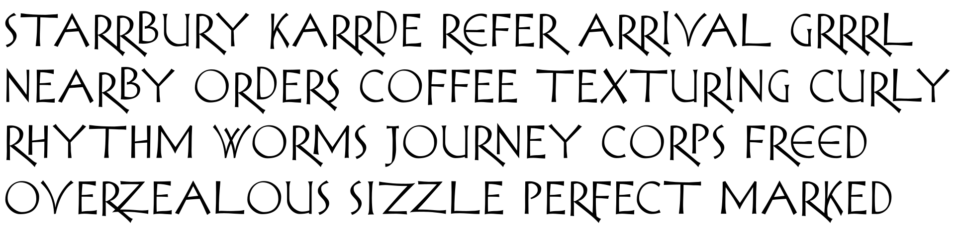
The design is deliberately unformal, giving the impression of haste and perhaps a breezy contempt for serious adherence to design standards. Weight, width, stroke are uneven and sometimes not consistent, as if a design has been set in stone partway through an unfinished draft.
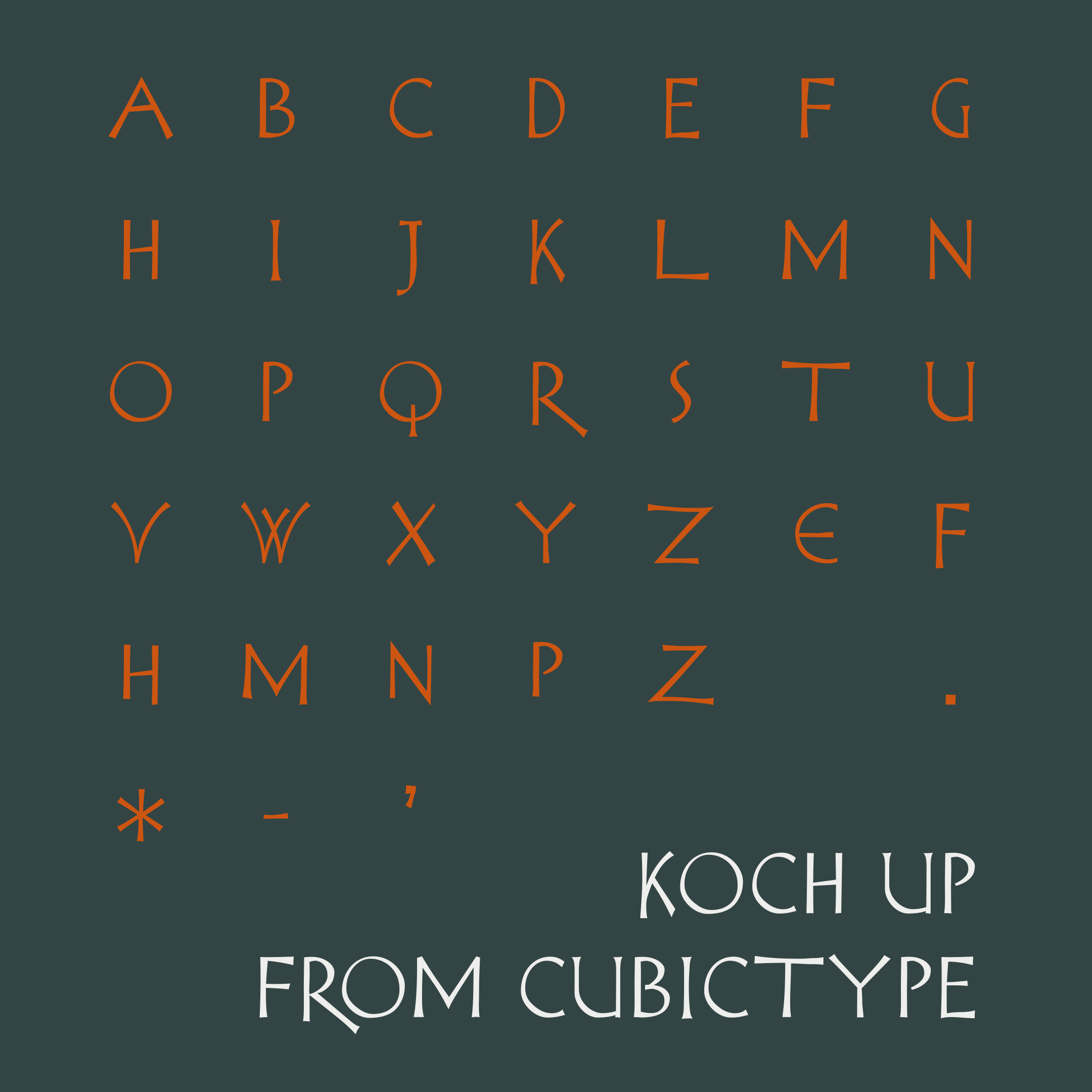
The repertoire is limited: only A to Z, apostrophe (U+2019), space, and the punctuation marks « . », « * », and « - ». Though, there are quite a few contextual alternates available (see below).
On R
The /R has a very long leg, and this requires some special attention to fit with other letters on its right. Fortunately i, the font designer, have attended to this, leaving you, the font user, free to concentrate on other matters.
Letters following /R are fit using a combination of careful drawing, kerning, vertical adjustments, and contextual alternates; in principle ligatures would be used, but i didn’t find it necessary.
Licence
The drawings are Rudolf Koch’s (kind of), so this is public domain.
Download
Click download now to get access to the following files:
Leave a comment
Log in with itch.io to leave a comment.